CSS Border Tricks with Collapsed Boxes
These tricks will help you achieve designs without resorting to the use of images, CSS3 gradient or extraneous markup. By collapsing boxes with zero line-height and height values, we can display content outside of the content box, over borders.
Bi-color background
This example does not include IE 6/7 workarounds (check the source code of this demo page for IE fixes).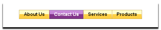
.parent {
  display:inline-block;
  text-align: center;
  border: 1px solid #cecece;
}
.child {
  display:inline-block;
  line-height: 0;
  height: 0;
  border-top: 1em solid #ffc;
  border-bottom: 1em solid #fdcf46;
  padding:0 .6em;
  vertical-align:bottom;
}

<ul id="menuBar-A">
<li><a href="#">About Us</a></li>
<li class="selected"><a href="#">Contact Us</a></li>
<li><a href="#">Services</a></li>
<li><a href="#">Products</a></li>
</ul>
Dots and pipes between list items
This example shows properly across browsers after some simple IE fixes.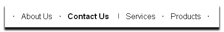
ul.one,
ul.two {
    margin-left:0;
    display:inline-block;
    *display:inline;
    zoom:1;
    height:12px;
    line-height:12px;
    padding:0;
}

li {
    float:left;
    display:inline;
    height:2px;
    line-height:2px;
    position:relative;
    top:.3em;
}

ul.two {border-left:1px solid #333;}

ul.one li {border-left:2px solid #333;}

ul.two li {border-right:2px solid #333;}

ul.one li.first-child,
ul.two li.last-child {
    border:0;
}

a {
    color:#000;
    padding:.4em .9em;
    *position:relative;
}

<div id="menuBar-B">
<ul class="us">
<li><a href="#">About Us</a></li>
<li class="selected"><a href="#">Contact Us</a></li>
</ul>
<ul class="ourOffer">
<li class="services"><a href="#">Services</a></li>
<li><a href="#">Products</a></li>
</ul>
</div>
Left and right-pointing triangles
This example does not include IE 6/7 workarounds (check the source code of this demo page for IE fixes).
#box {
  line-height: 0;
  height: 0;
  border: .4em solid transparent;
  border-left-color: #333;
  border-right-color: #333;
  padding: 0 .3em;
  display: inline-block;
}

<ul id="menuBar-C">
<li><a href="#">About Us</a></li>
<li class="selected"><a href="#">Contact Us</a></li>
<li><a href="#">Services</a></li>
<li><a href="#">Products</a></li>
</ul>
IE 6 and border transparency
IE 6 does not support the keyword "transparent" for border color. When you use this value, IE 6 draws a black border.
The fix for this is to use the chroma filter which displays a specific color of the content of the object as transparent. For example, to create a right pointing arrow you could use this rule:
#Box {
  height: 0;
  width: 0;
  border: 10px solid transparent;
  font-size: 0;
  _border-color: pink;
  _filter: chroma(color="pink");
  border-left-color: #333;
}
The font-size declaration is another workaround for IE 6. It is to make sure this browser does not increase the height of the box.
Stop the presses! I just learned a new trick (thank you Chungho Fang):
The magic [to create border transparency in IE] is to set ‘border-style’ to either dashed or dotted
That's it! This is just one more way to use borders to achieve image-less design.
Further reading
About the author: Thierry Koblentz is a front-end engineer at Yahoo!
He owns TJK Design, ez-css.org and css-101.org. You can follow Thierry on Twitter at @thierrykoblentz .